



🎨 Beyond Aesthetics: How Color Psychology Impacts Your Brand
🎨 Beyond Aesthetics: How Color Psychology Impacts Your Brand
In graphic design, color is more than just a decoration—it’s a silent language. It’s the first thing a viewer’s brain processes, often before they even register the name of the brand or the shape of the logo.
Why Color Matters
Studies suggest that people make a subconscious judgment about a product within 90 seconds of viewing. Up to 90% of that assessment is based on color alone.
The Emotional Cheat Sheet
| Color | Emotional Response | Common Industries |
|---|---|---|
| Red | Excitement, Urgency | Food, Tech, Fitness |
| Blue | Trust, Professionalism | Finance, Health |
| Green | Growth, Nature | Organic, Real Estate |
| Black | Luxury, Power | High Fashion, Tech |
3 Tips for Your Next Palette
- Follow the 60-30-10 Rule: Use a primary color (60%), secondary (30%), and accent (10%).
- Check Accessibility: Ensure high contrast for readability and inclusivity.
- Context is King: Always consider industry standards and cultural meanings.
Don’t just pick colors because they look “cool.” Pick them because they tell the story you want your audience to hear.
What’s your “signature” color? Let’s talk in the comments!
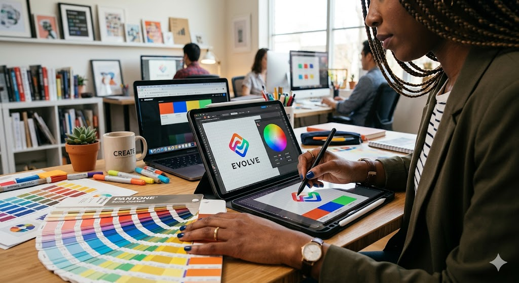
The Master Guide to Color Theory: Elevating Your Graphic Design
In the competitive world of graphic design, the difference between a “good” project and a “great” one often lies in the mastery of color. It isn’t just about aesthetics; it’s about psychology, accessibility, and brand storytelling. In this guide, we dive deep into the technical and emotional aspects of choosing the perfect palette.
1. Understanding the Color Wheel
To use color effectively, you must first understand how colors relate to one another. The color wheel is your roadmap for creating harmony:
- Monochromatic: Using different shades and tints of a single hue. This creates a clean, polished, and soothing look.
- Analogous: Choosing colors that sit next to each other (e.g., Blue, Blue-Green, and Green). This mimics nature and feels incredibly harmonious.
- Complementary: Colors from opposite sides of the wheel (e.g., Orange and Blue). These provide high contrast and high energy, perfect for “Call to Action” buttons.
- Triadic: Three colors equally spaced around the wheel. This offers a vibrant, balanced feel that is popular in youth-oriented branding.
2. Industry Case Studies: Why They Chose Those Colors
| Industry | Primary Color | Psychological Intent | Real-World Example |
|---|---|---|---|
| FinTech | Dark Blue | Security, Stability, Trust | PayPal, Visa, Chase |
| Entertainment | Red / Black | Excitement, Drama, Boldness | Netflix, Marvel, YouTube |
| Eco-Friendly | Soft Green | Sustainability, Health, Calm | Whole Foods, Starbucks |
| Luxury | Gold / Black | Exclusivity, Wealth, Elegance | Rolex, Chanel, Lamborghini |
3. The Impact of Tints, Tones, and Shades
A common mistake for beginners is sticking only to “pure” hues. Understanding how to modify a color changes the design’s “temperature”:
- Tints (Color + White): Often used in feminine or lighthearted designs to create a soft, airy feel.
- Shades (Color + Black): Adds depth and mystery. Useful for adding “weight” to a professional corporate site.
- Tones (Color + Grey): These are “muted” colors that feel sophisticated and less aggressive than bright, saturated colors.
4. Professional Workflow: How to Build a Palette
When starting a new client project, follow this 3-step process to ensure your design performs as well as it looks:
- Identify the Core Emotion: Is the brand “disruptive” or “reliable”? Match the emotion to a base hue first.
- Test for Contrast: Use tools like Adobe Color or Coolors to check if your text is readable against your background colors.
- Limit Your Selection: Less is more. Aim for 3 to 5 colors maximum to maintain a professional, cohesive look.
“Color does not add a pleasant quality to design—it reinforces it.” — Pierre Bonnard
Conclusion: Color is the most powerful tool in your design arsenal. By moving beyond “what looks good” and focusing on “what feels right” for the brand, you’ll create work that resonates on a much deeper level.
No Comments
Sorry, the comment form is closed at this time.